Client: Adidas + Tulsa University
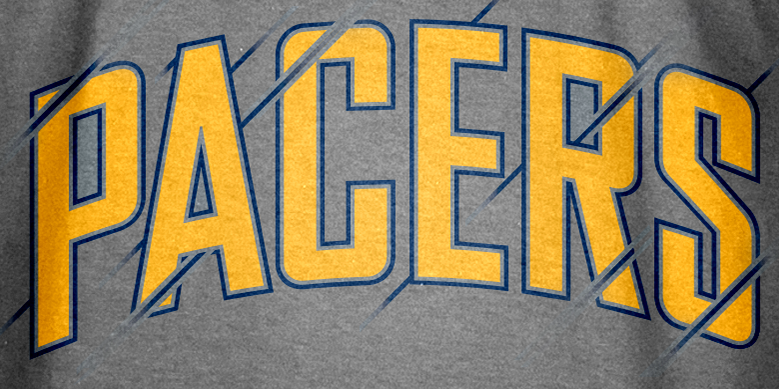
Brand Identity. Lettering.
Typeface Consultant: Andrew Harrington

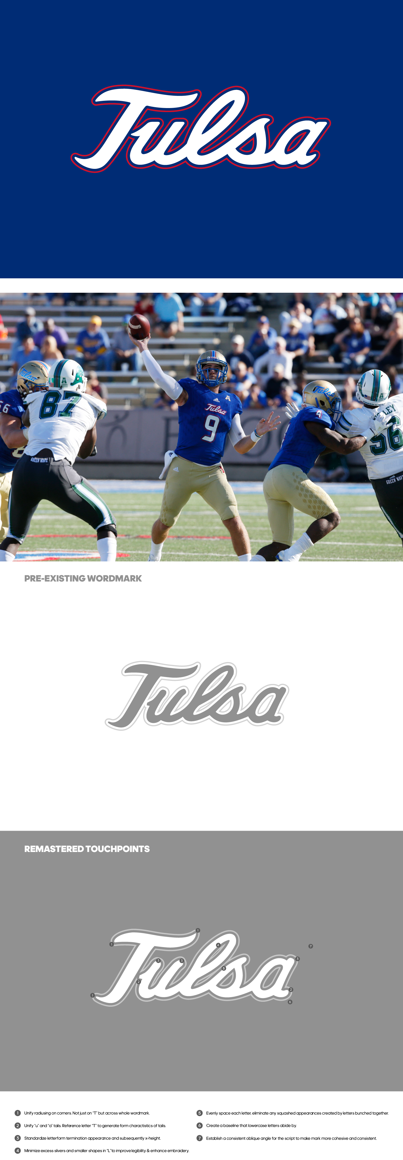
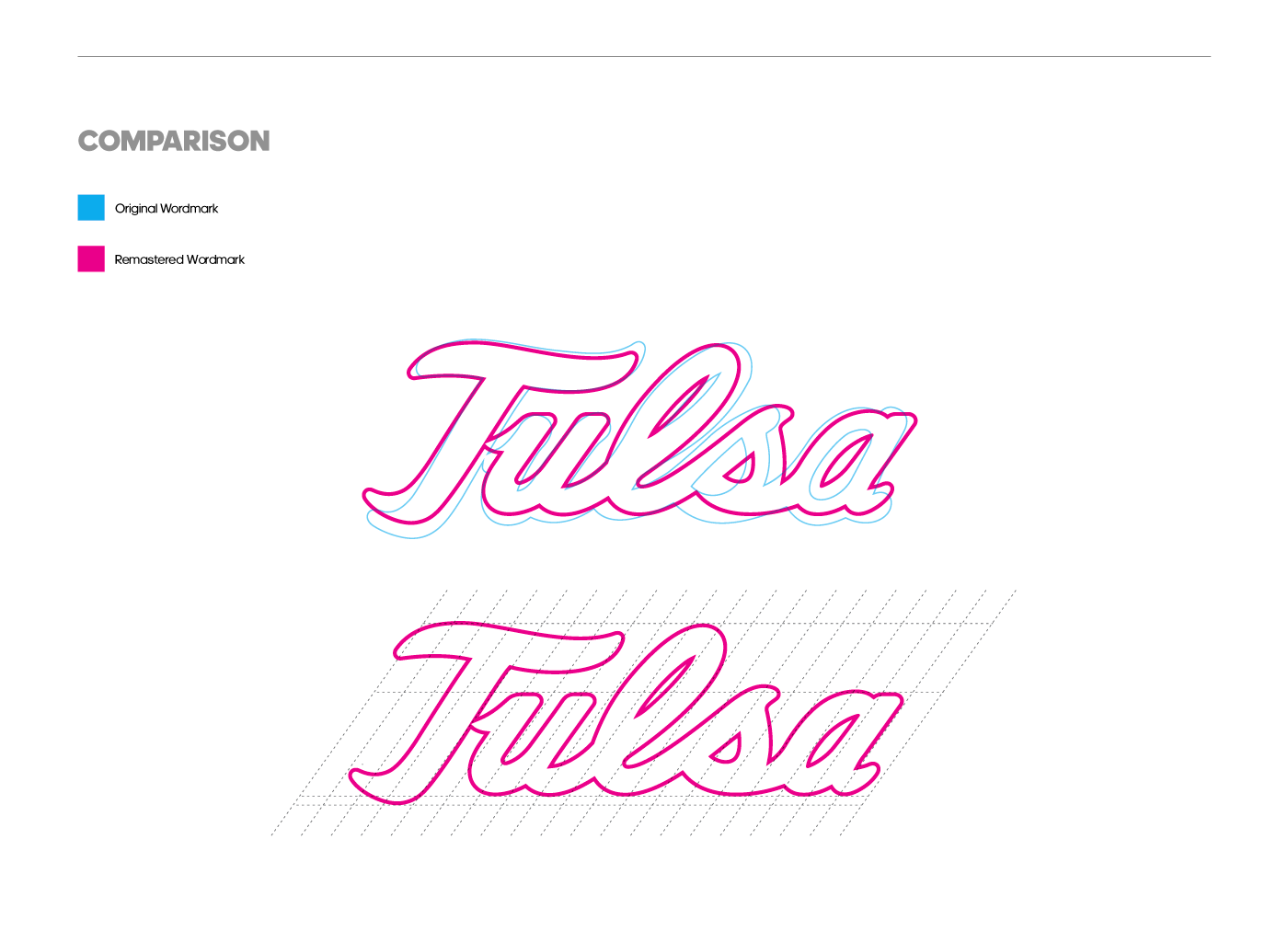
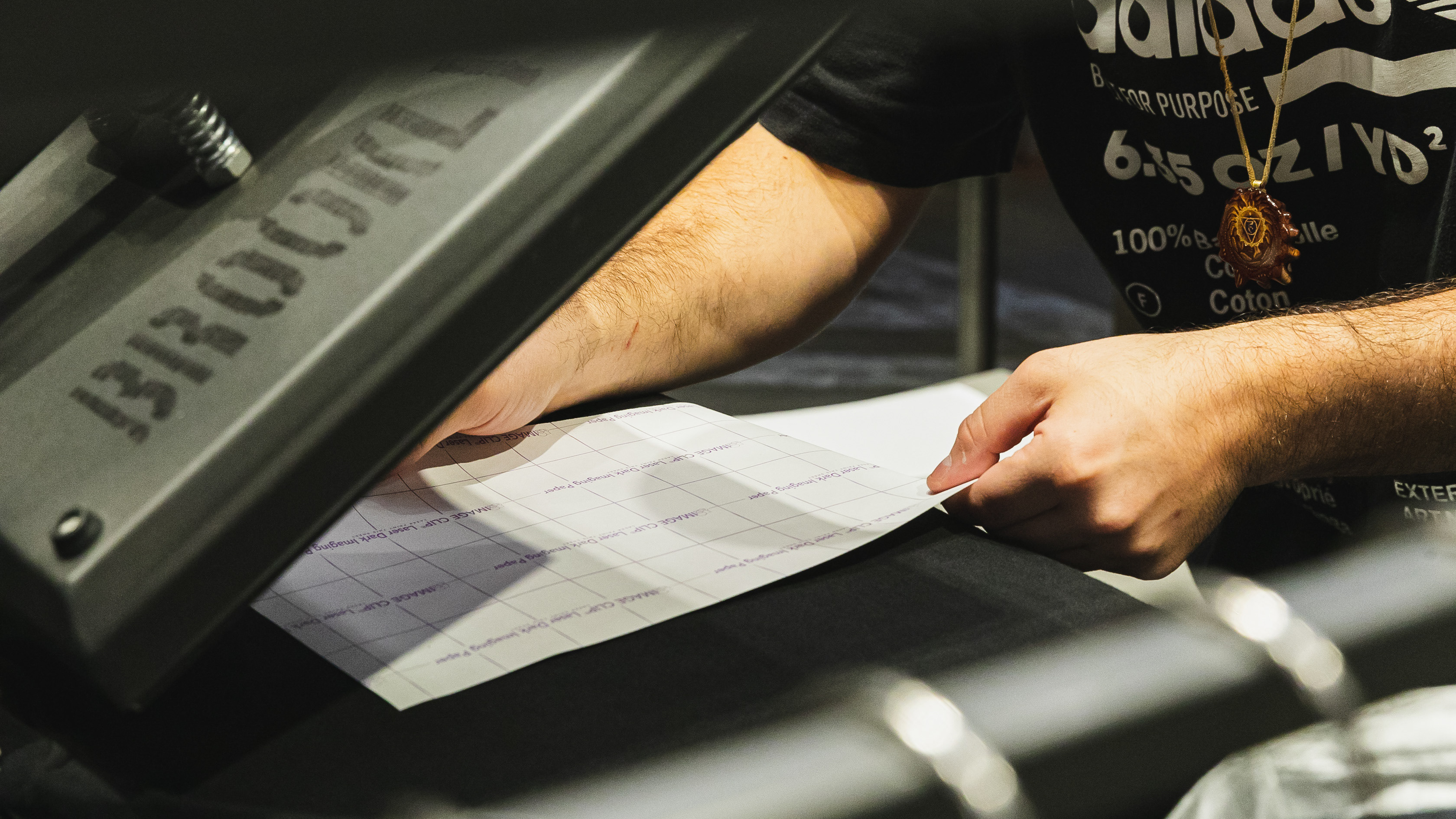
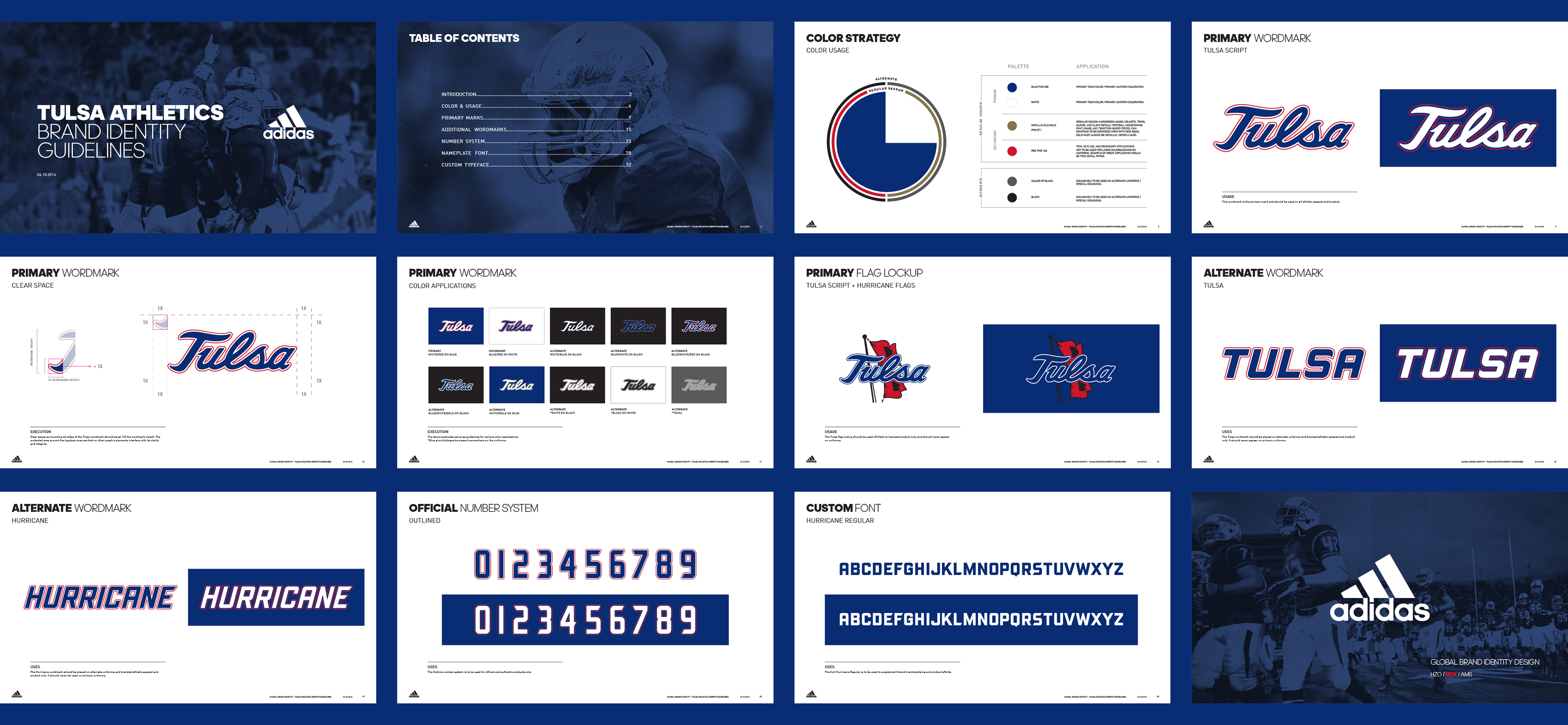
A great level of refinement went into remastering the primary script. Numerous iterations were designed, pressure-tested and reworked, round after round, until ultimately yielding a version that felt right. Numerous small shifts combined to produce a cleaner mark void of tedious errors, small spaces or intrusive outlines. These issues, while small at first glance, created huge difficulties and added costs for the University when it came to manufacturing their uniforms. We helped them create a strong brand presence while effectively streamlining their equipment.
The Tulsa Wordmark incorporates a hidden nod to their moniker, The Golden Hurricane, with the terminals of the "S" creating a swirling motion.
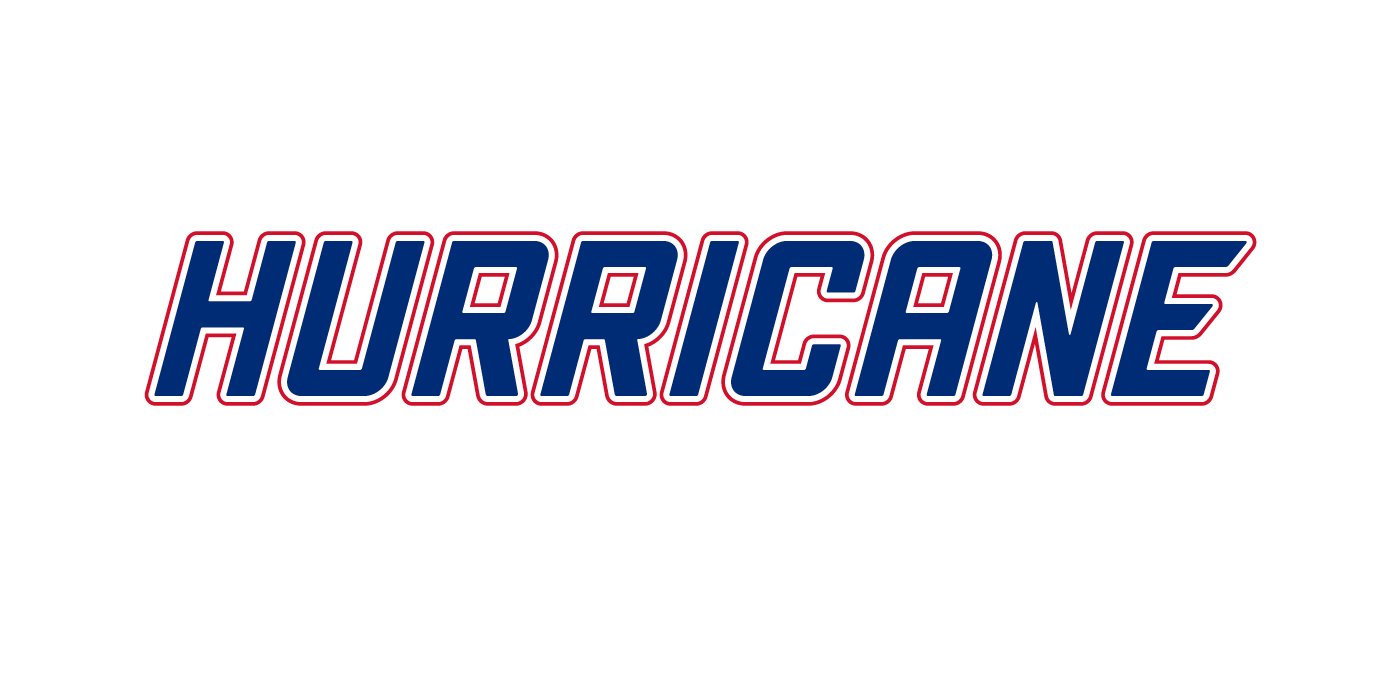
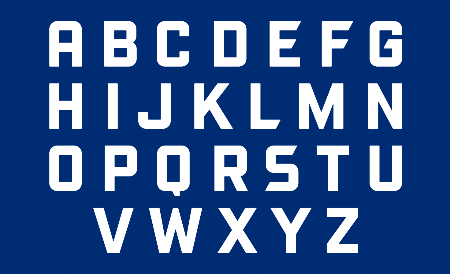
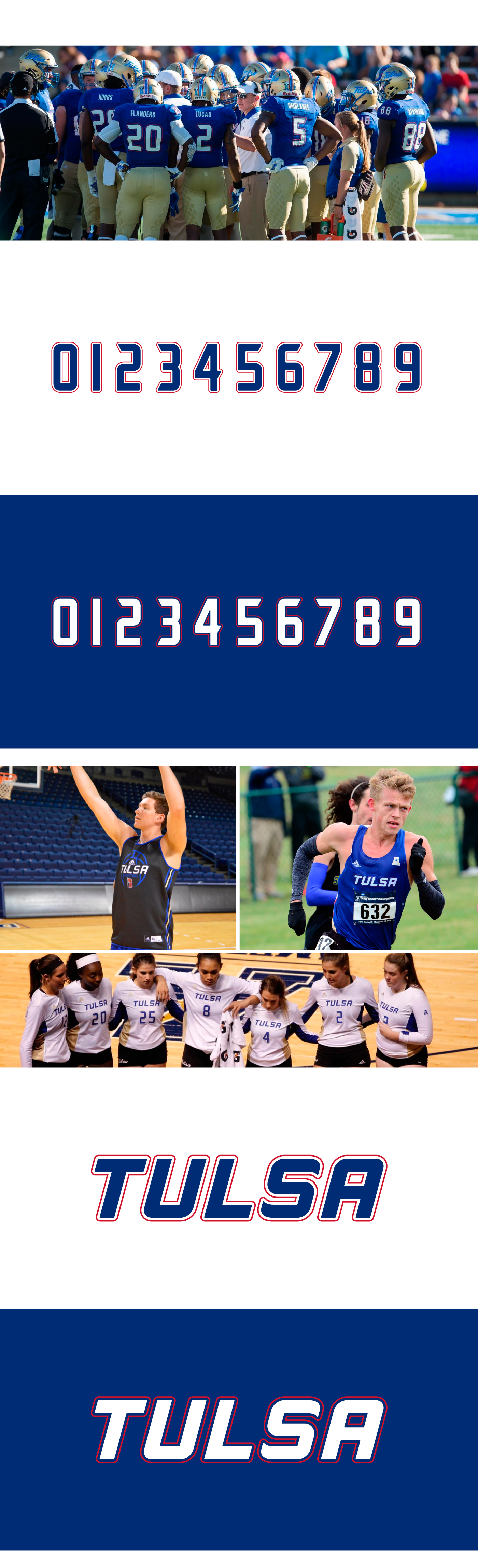
A custom display typeface was developed using the wordmarks as a launching point. The corner radiusing and letterform weights are consistent throughout all new wordmarks, and draw their proportions from the weight of the script. This created a top-to-bottom uniformity through-out the brand. It is evidenced by looking at the new uniforms across different sports.
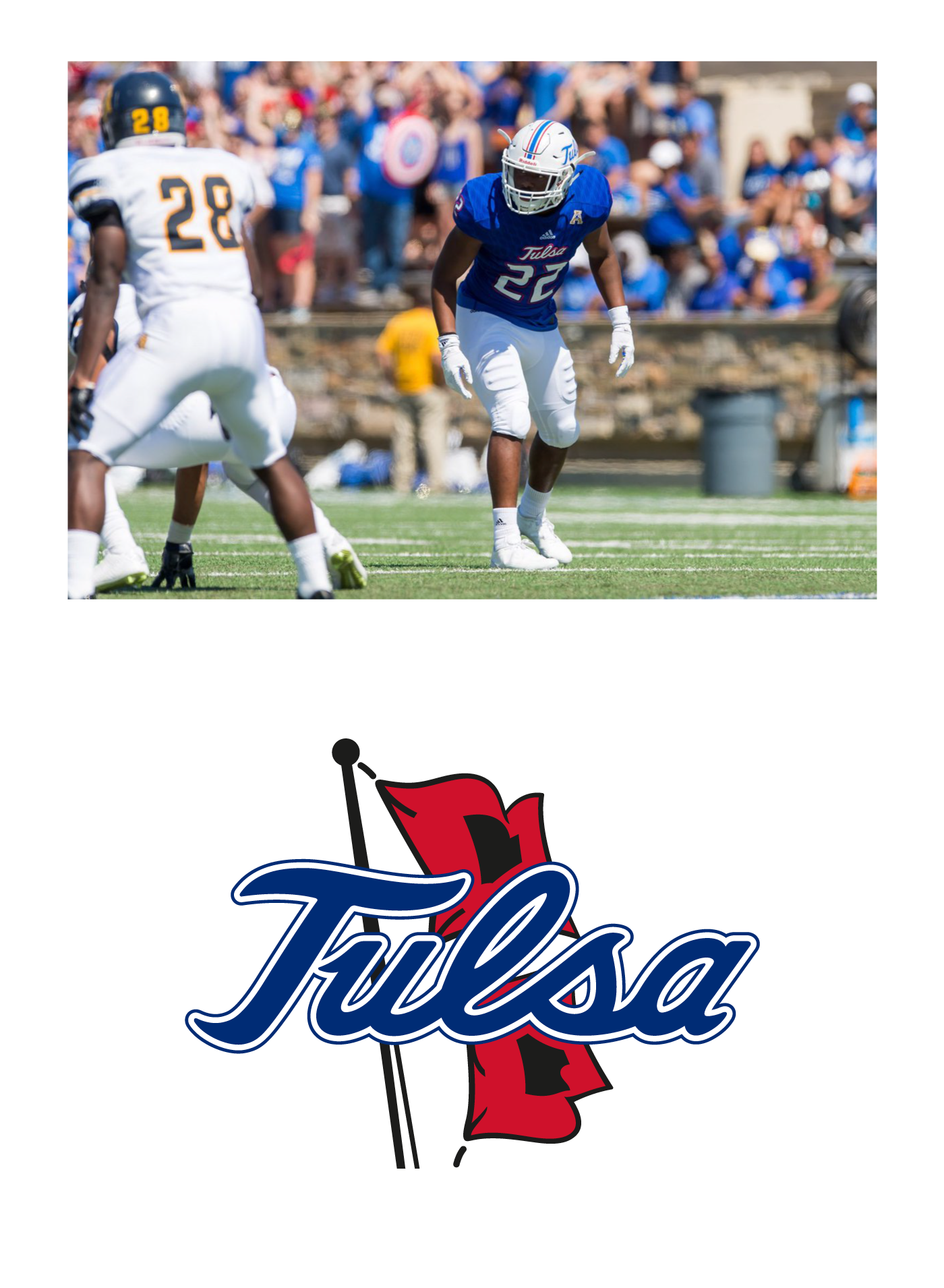
We made sure to update any brand marks where their script was being used, including their secondary flag logo. Finally, rounding out the project, we created a branding guideline to define the usage and implementation of the system.
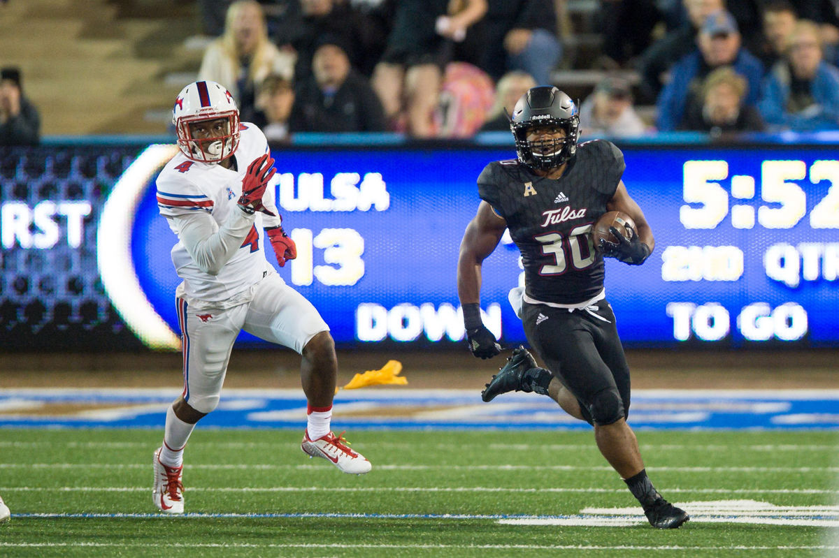
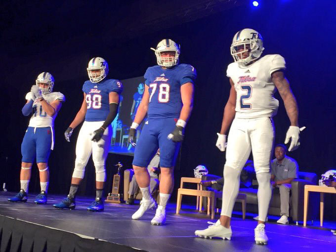
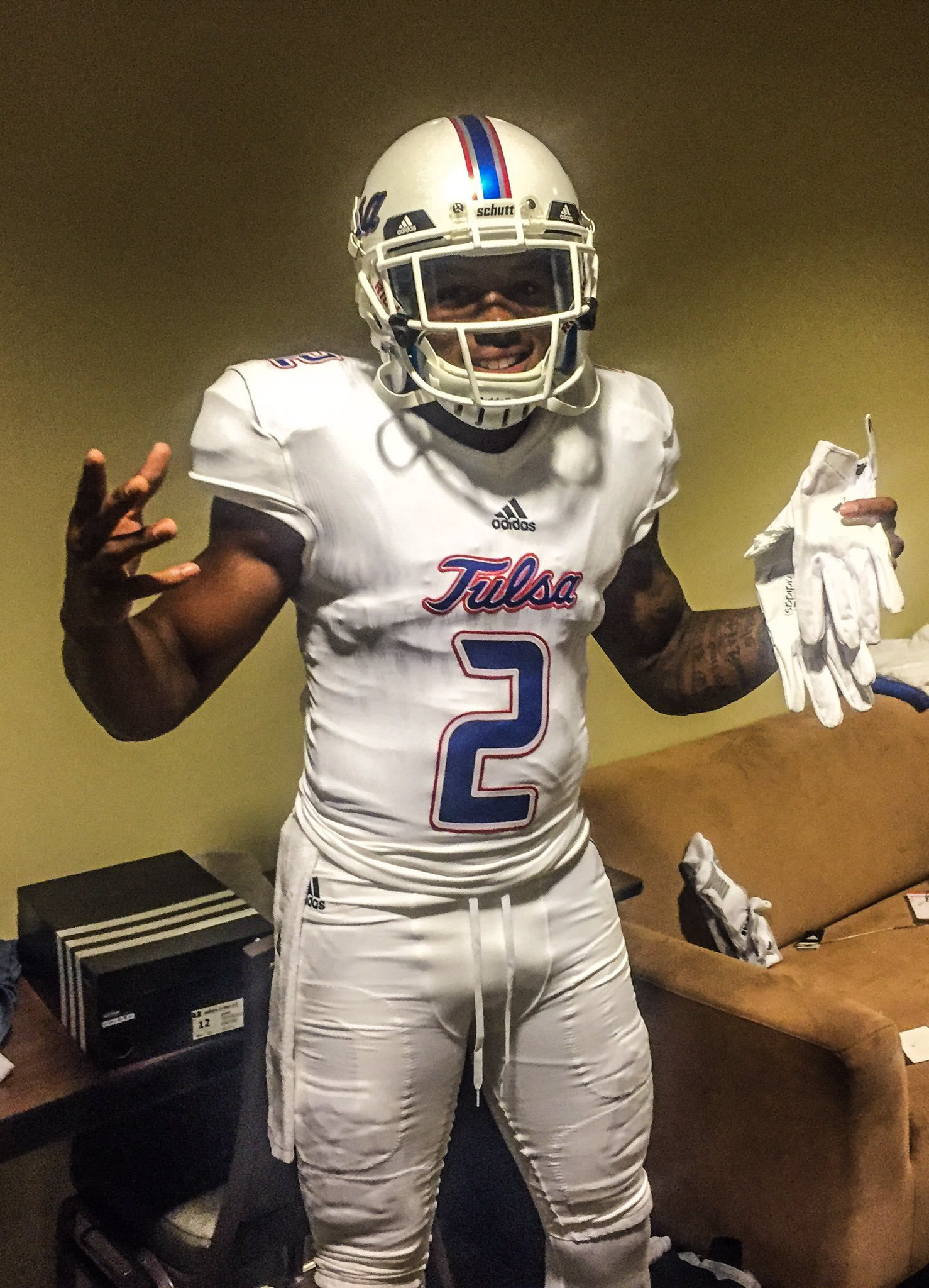
Photography courtesy of the University of Tulsa Athletics department.