Client: Adidas + Rice University
Brand Identity. Uniform Prototyping.
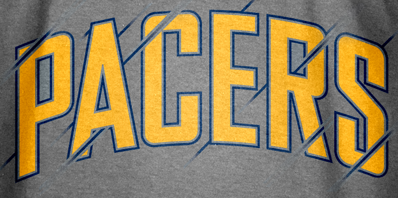
Previous wordmarks (shown below) failed to complement the Primary "R" logo in a way that felt modern, unique or true to the brand's history. While the wordmarks of the past served a purpose, the new wordmark serves as a much more authentic brand symbol. We preserved the angles and cutlines to emphasize the calligraphic nature of the primary R. It is clear to see how well the new lettering complements their logo when you compare them side-by-side.
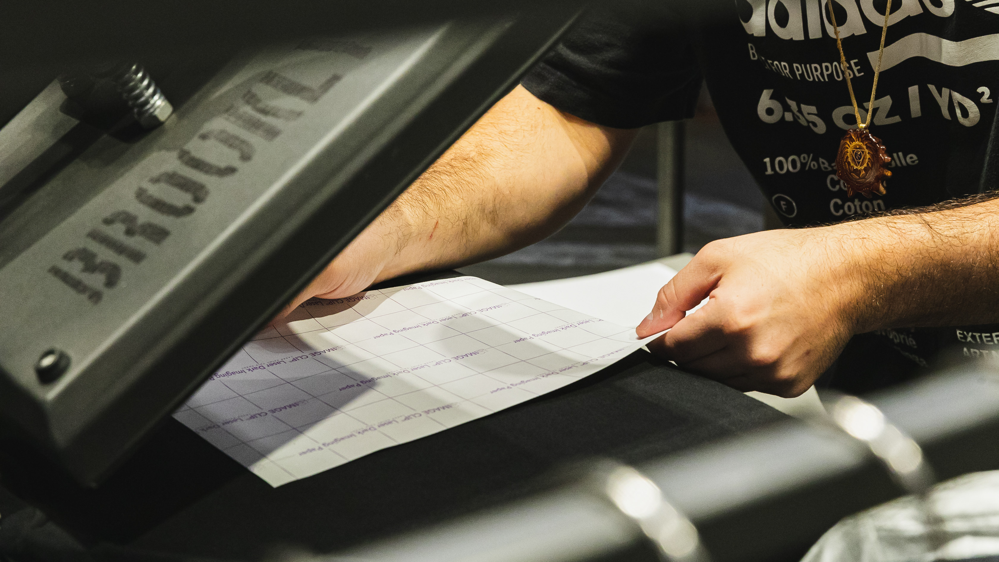
Part way through the process, we created prototypes for baseball and basketball jerseys to pressure test the new indicia. We wanted to see how the wordmarks would complement the numbers as well as how the overall system would complement the new 2017 uniform designs. One of the biggest challenges was color matching the navy jersey to the ink printed by the heat transfer machine. We calibrated many different colors and CMYK values before finding the right hue. Always a curveball!


