Visit the Live Website
Creative Direction. Integrated Branding. eCommerce.
3D Design: Trevor Gessay Motion Design: James Heredia
In late 2020 I was approached by Robert Coviak, an entrepreneur with a business idea in need of some brand marketing to back it. Having helped passionate owners like Robert before, I was excited to peel back the layers of his idea as well as figure out what made it unique.
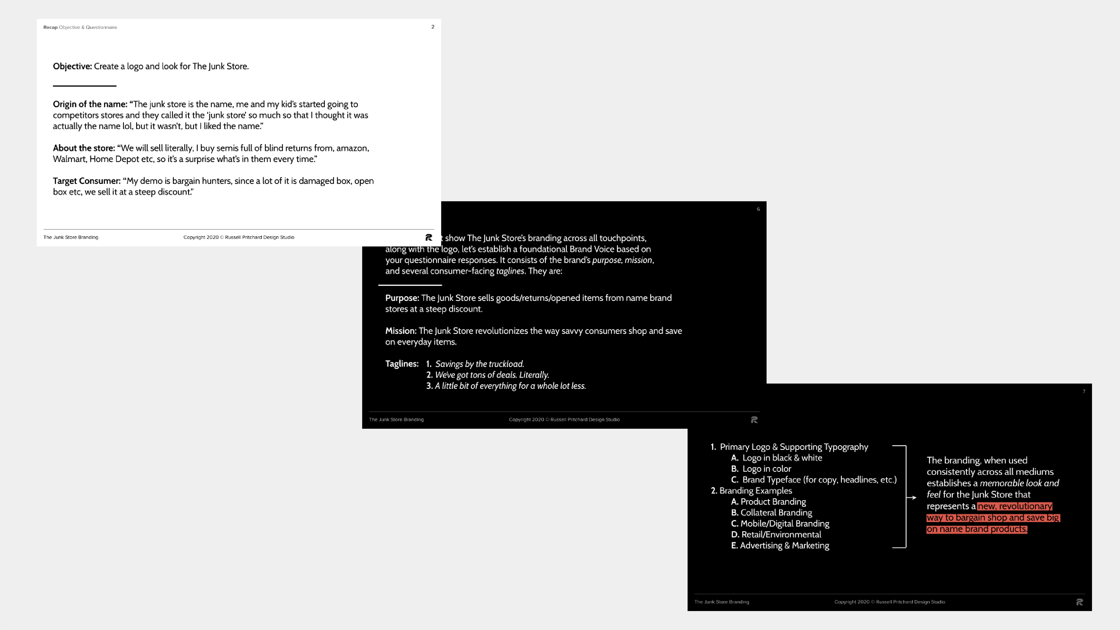

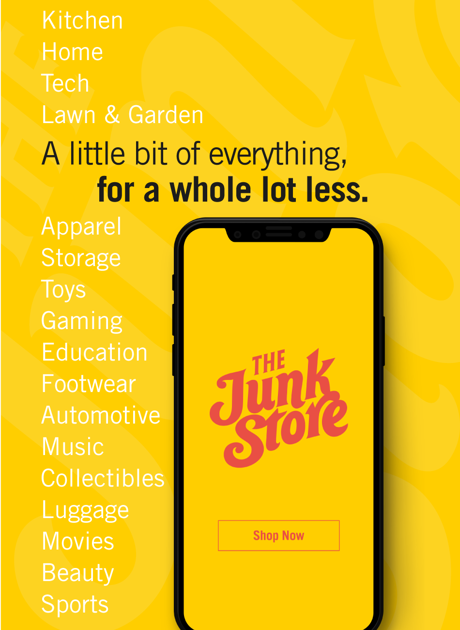
Given the unpredictable inventory of the store, it was crucial to establish a visual identity that steered clear of tangible objects in order to prevent any misleading associations. The logo needed to avoid creating an impression that it directly represented the shop's stock. To address this concern, I shifted my attention towards utilizing expressive lettering as a means to effectively convey a unique personality that customers could easily connect with and understand. This approach aimed to foster a stronger sense of familiarity, thereby cultivating more memorable brand interactions that leave a positive and lasting impression.
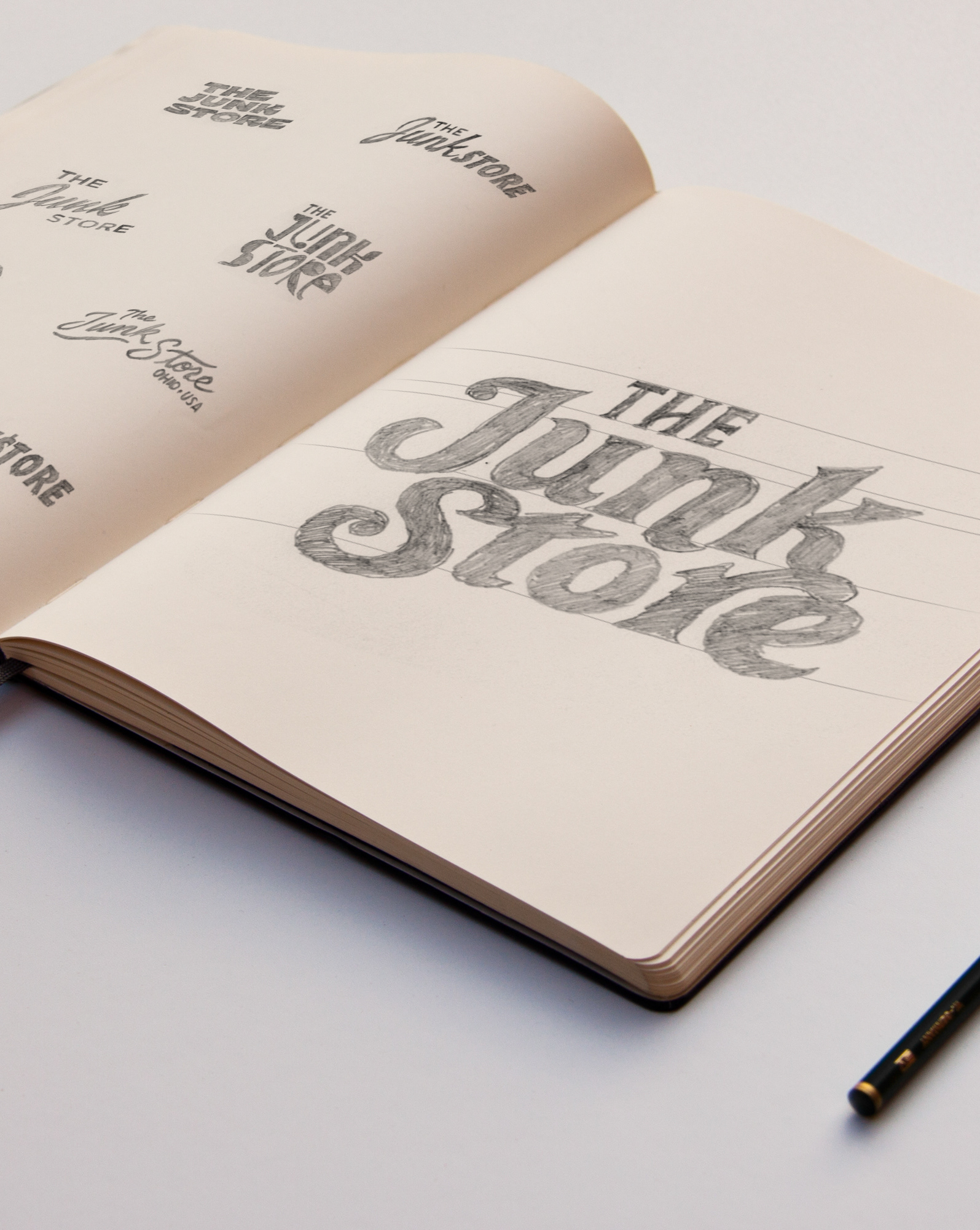
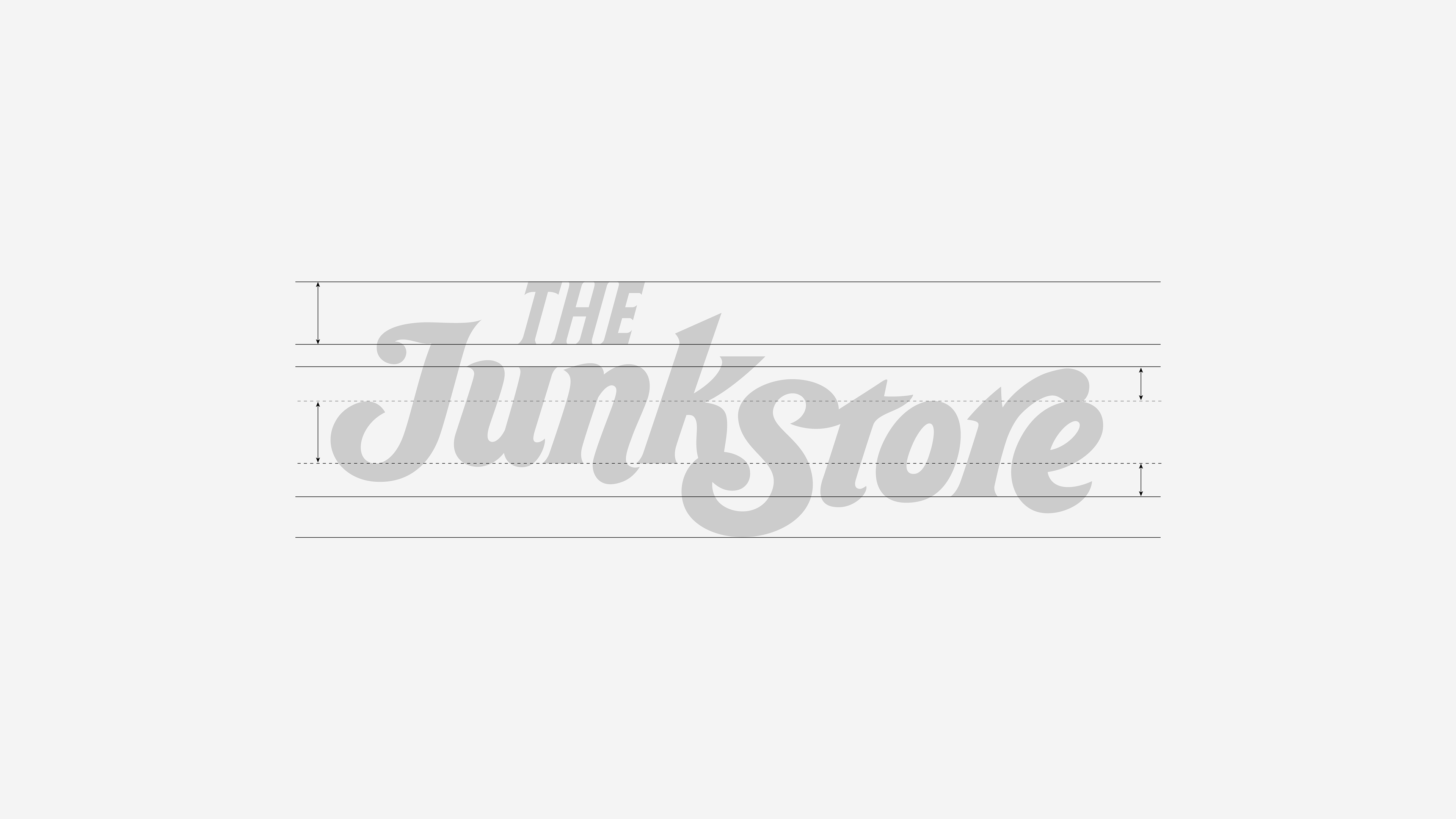
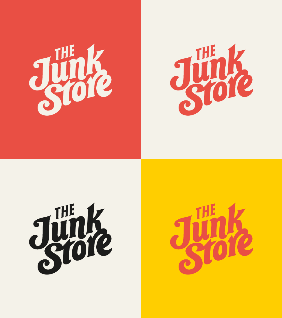
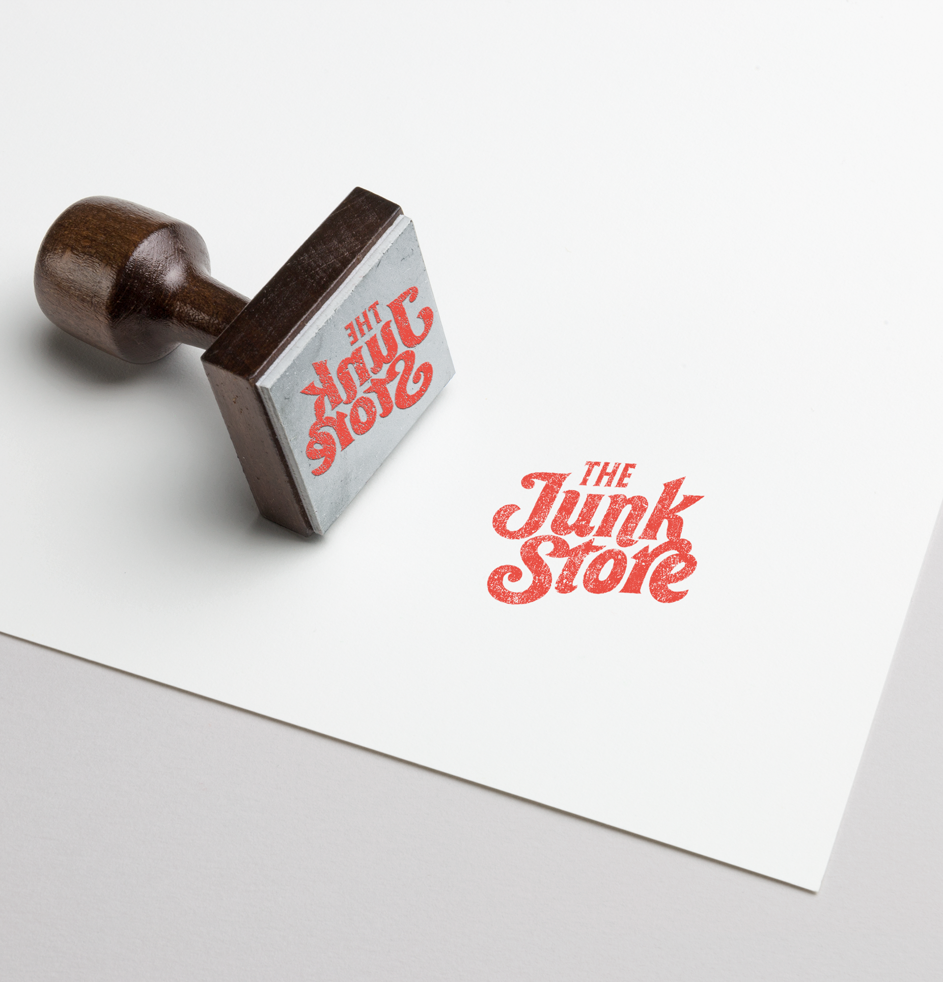
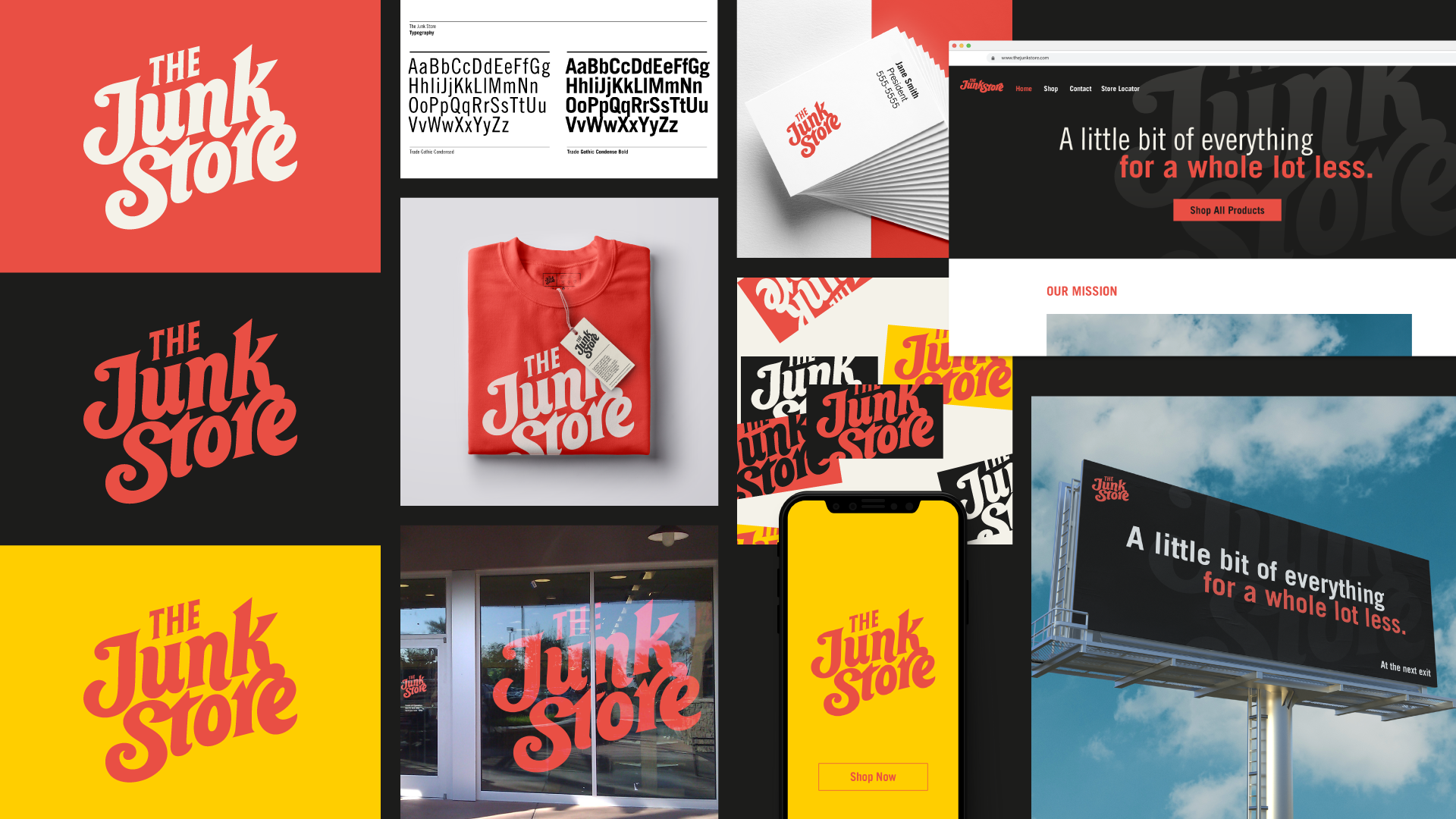
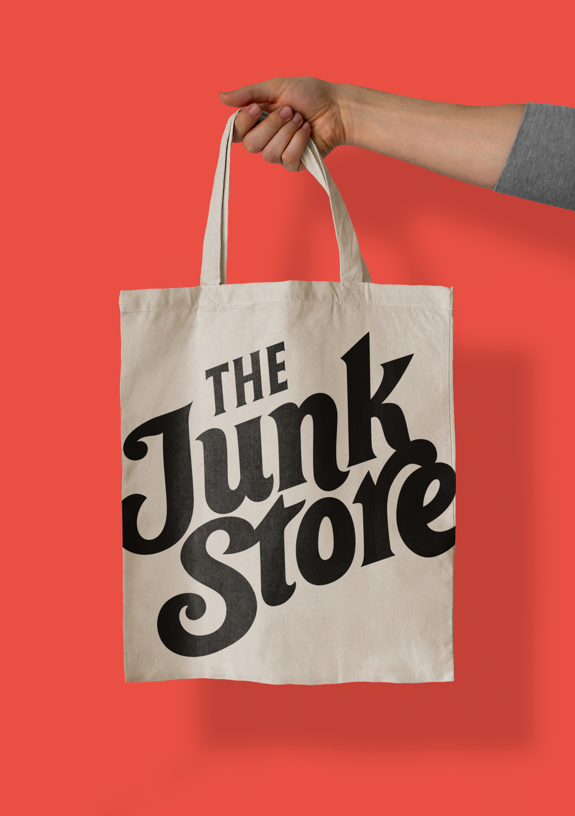
After careful consideration, we ultimately settled on a cheerful, custom-made, script that exuded a sense of fun and authenticity, aligning perfectly with the overall vision. In addition to the vertically stacked mark, we also needed a horizontally-oriented version to use for different applications. It was essential for both variations to evoke the same overall sentiment, ensuring consistency across different formats.
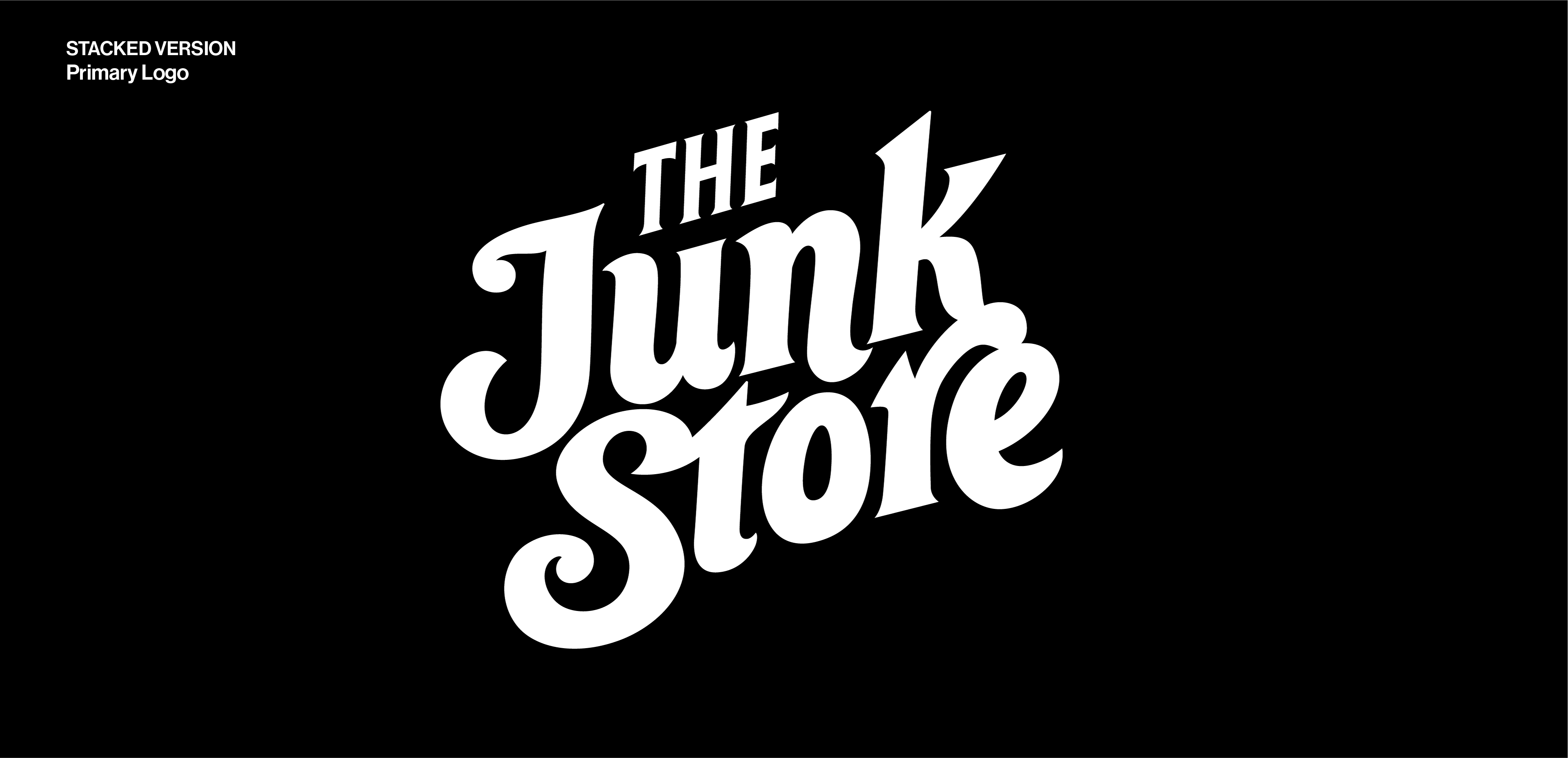
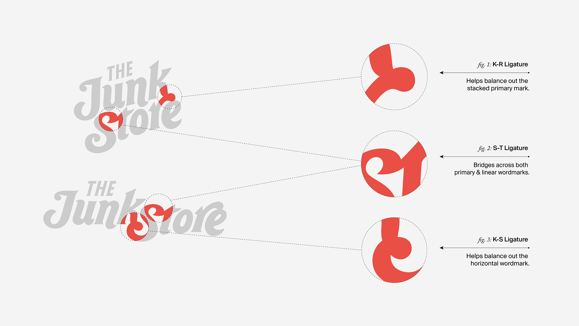
In order to replicate the logo in another layout, I identified unique characteristics that when put together formed its visual DNA. There were two main identifiers: first, the staggered or jogged baseline, and second, the ligatures where two letters joined into one-another. These characteristics set it apart from standard typesetting and elevated it to a more memorable and custom mark. Those traits were cascaded to the horizontal mark to create cohesion across both versions.
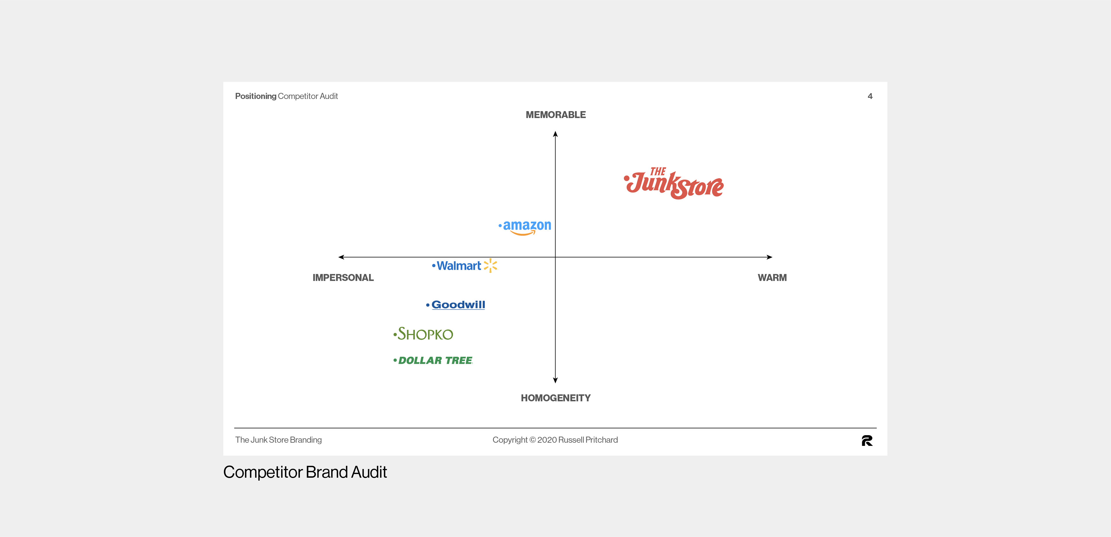
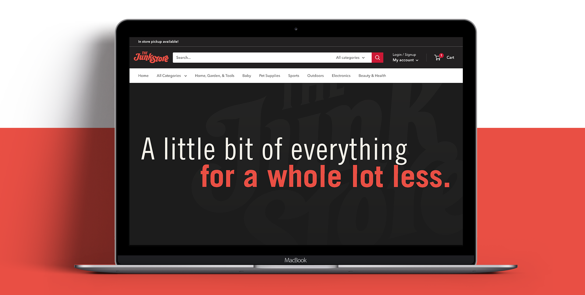
After finalizing the two logos, color was added along with a motion identity, or memorable animated gesture that captured the brand's playful personality. This could be used as a profile photo on social, bookend content, or act as a punctuation, or sign-off. Color was decided on by auditing popular competitors in the space and intentionally avoiding those which were being used or associated with already-well-known brands. We noticed a lot of blues and greens (think Amazon, Walmart and Dollar Tree), so we chose a custom orange-red that could stand out amongst the crowd.

No vibrant retail shop would be truly complete without a captivating tagline. In addition to crafting the visual and motion identity, I created a whimsical tagline that would serve as an inviting introduction to The Junk Store. This tagline beautifully echoed the joyful essence of the visual language and seamlessly complemented the overall brand. It succinctly conveyed an elevator-pitch for new customers, offering a brief and engaging glimpse into the unique world of The Junk Store.
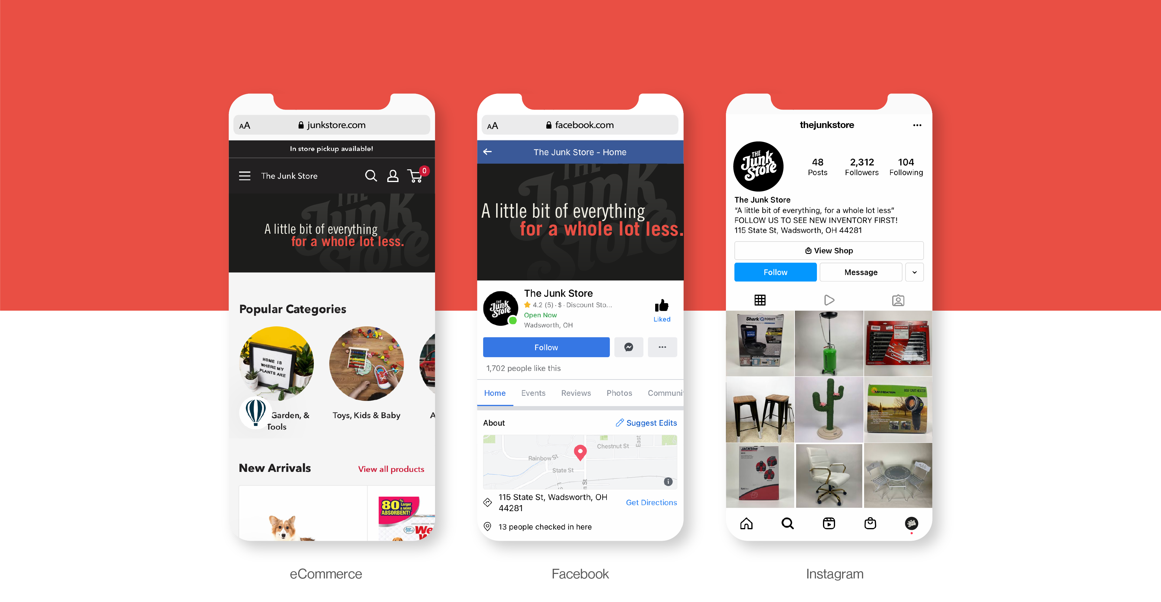
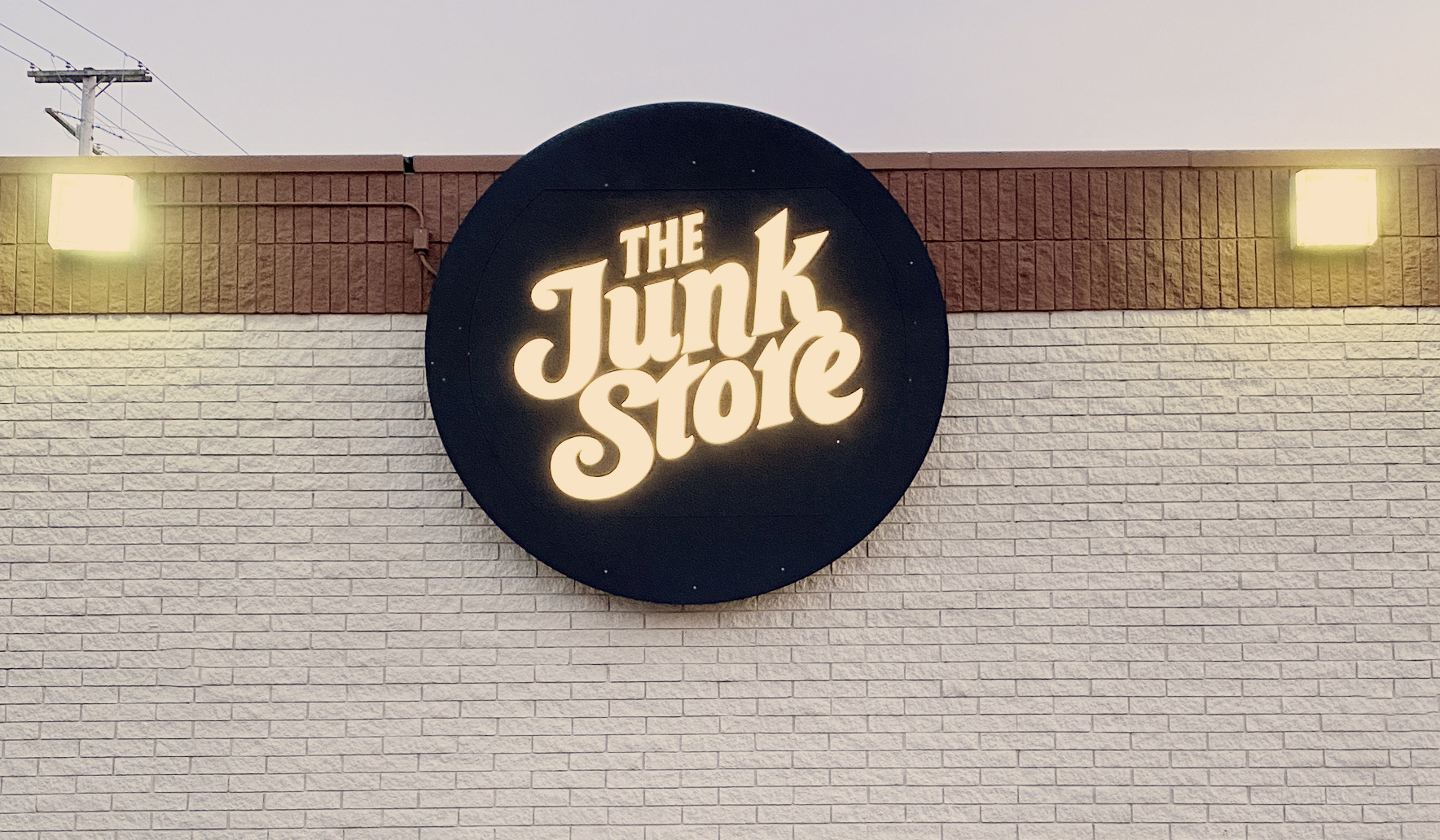
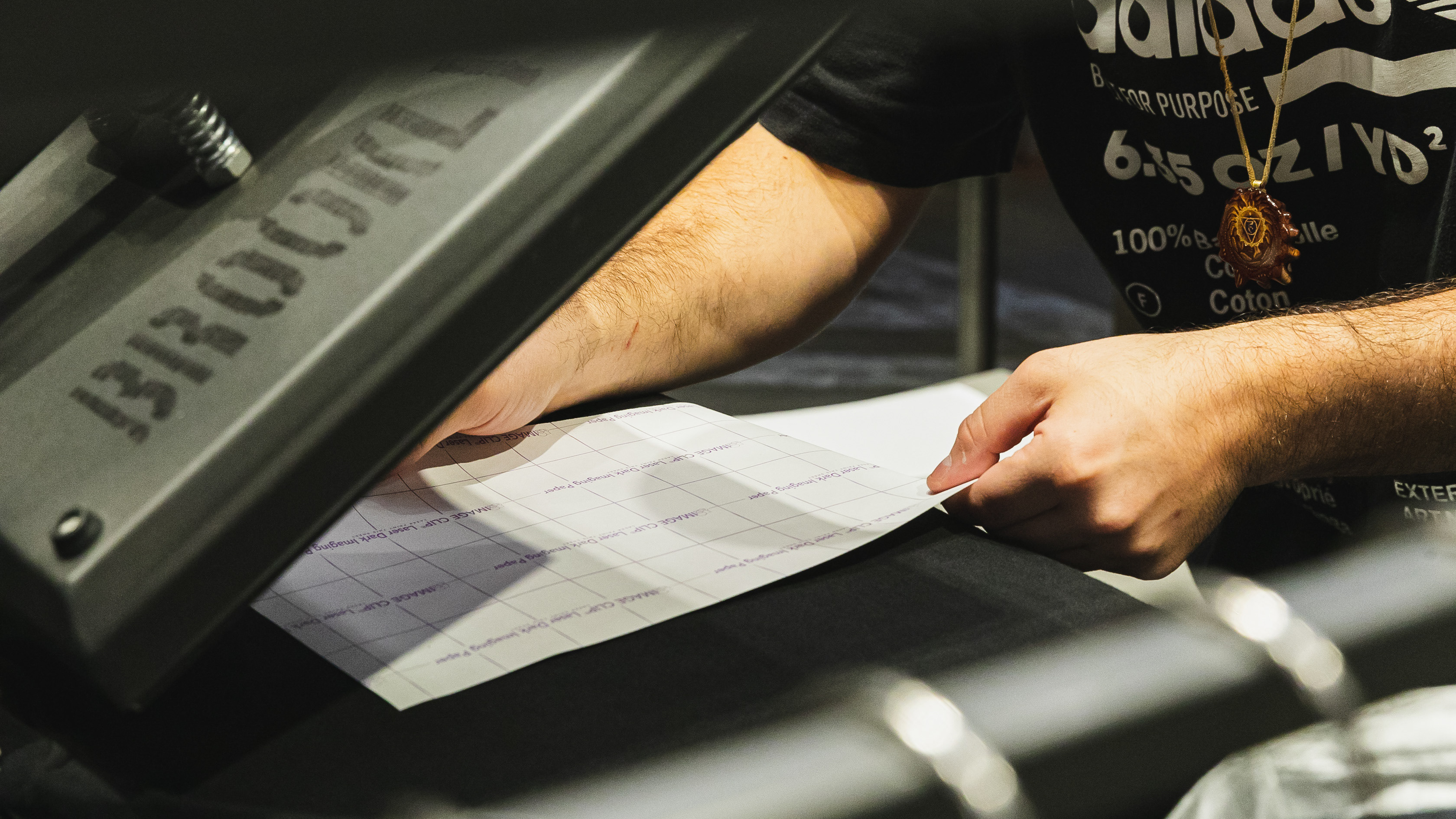
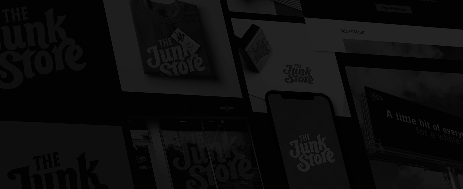
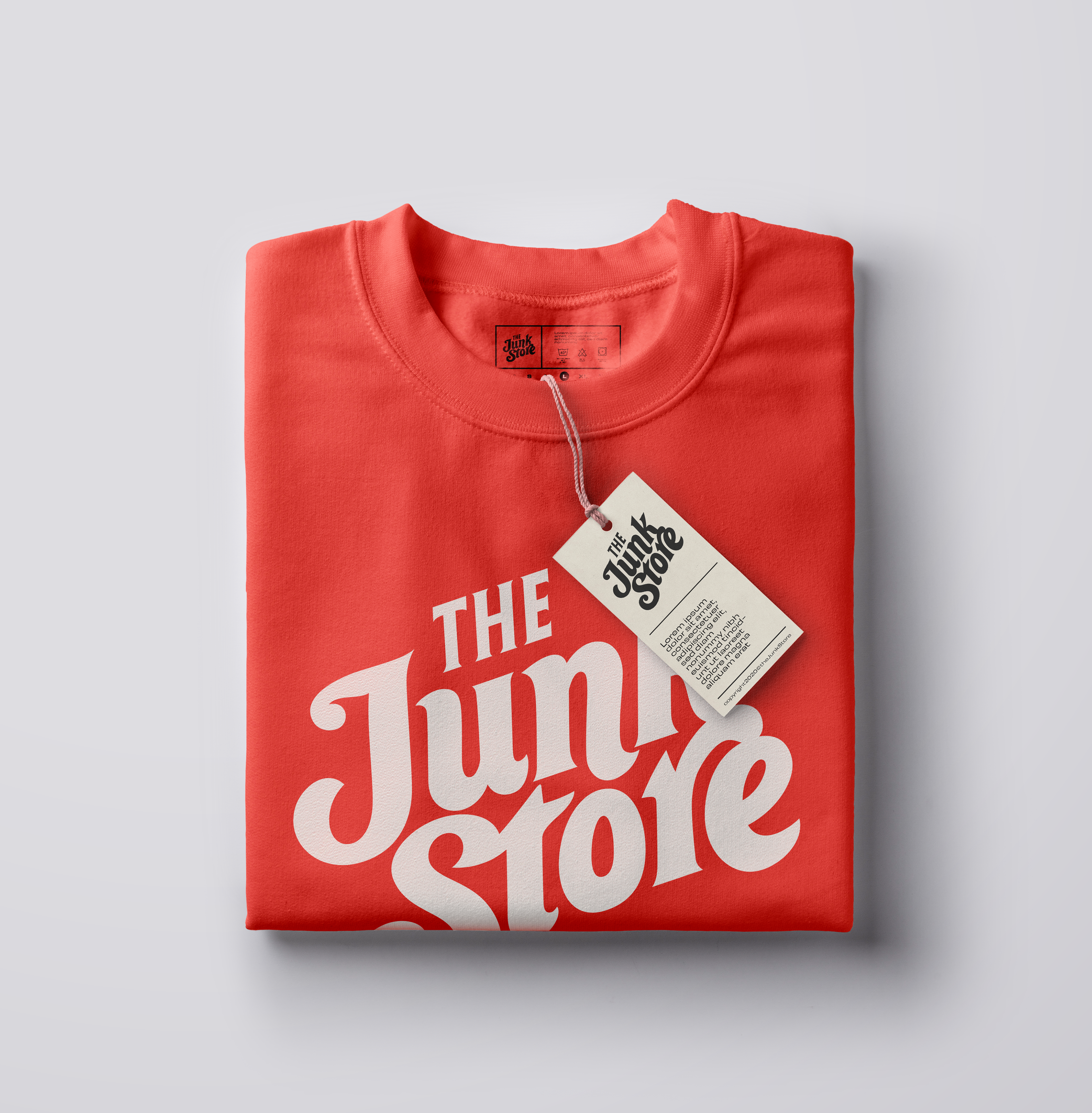
For a birds-eye view that articulated visual guidance across the brand, I developed a Look and Feel document which helped illustrate the branding in-situ. From business cards and t-shirts, to re-usable totes and storefront signage, The Junk Store was ready to set up shop.
Since its launch in late 2020, amidst the challenging times of the pandemic, The Junk Store has persistently thrived. Not only has it successfully opened two physical stores in Ohio, but its eCommerce website has also witnessed remarkable growth. The Junk Store defies its name, and it has been an absolute delight to witness this humble concept evolve into a flourishing venture.